


By Diane Harrison
It’s simple human nature to believe more of what you see than what you hear. The human brain is wired to process visual information more easily than contextual words. According to a June 15 Washington Post article, "Charts Change Hearts And Minds Better Than Words Do," charts are a more effective visual than tables of text. Data, particularly complex or vast amounts of data, which is arranged in a graph or other summary picture, is better understood when translated into an optic.
SHOW AND TELL
Pictures can tell compelling stories. When trying to sell an alternative investment concept, the strategic use of graphics can punctuate the point you are trying to make, such as Alternative Asset Selling Point 101?portfolio allocation performance increases while volatility decreases with the inclusion of alternatives into traditional asset classes. How much stronger is this point made when showing the impact alternatives have on a portfolio mix such as the comparison does below?
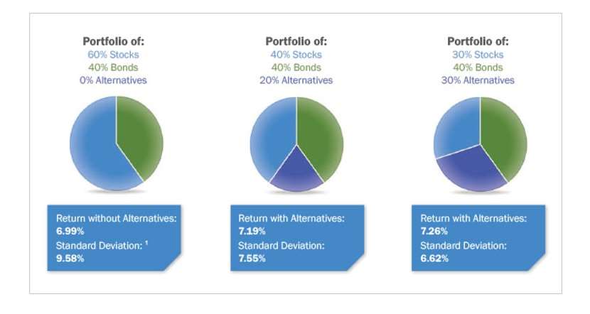
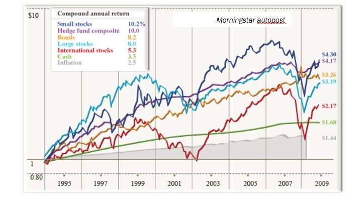
Most numerical conclusion points can be strengthened by accompanying the wording with some form of visual marker. Alternatives marketers frequently show multiple asset class performance comparisons in an effort to convince investors to allocate more of their funds to the alternatives category. It’s clearly a more powerful statement to make for alternatives to showcase the strong relative performance this asset class reflects over a medium to long period of time, such as on the Morningstar graph following:
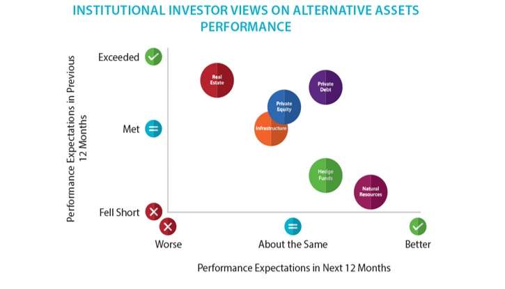
But it doesn’t just apply to showing the numbers story. Visuals can also be useful to capture investor sentiment preferences and survey data conclusions. Preqin’s INVESTOR OUTLOOK: ALTERNATIVE ASSETS H1 2017 included a particularly powerful graphic for summarizing investor sentiment regarding several asset classes as shown here:
KISS (KEEP IT SIMPLE, S****D)!
Synthesizing lots of information or complex information into a clean and simple format is always a positive marketing tool. A key selling feature of alternative assets is to be able to demonstrate the benefits of its non correlation to traditional asset classes and its performance when these traditional asset classes are stressed.
For example, one of the strongest selling points for including managed futures into an overall portfolio to increase diversification and uncorrelated market performance is to demonstrate how divergent the performance of this asset class has been in past decades. This point is often referenced by alternatives marketers through referring to statistical studies and research, but that is a dry and clinical format in most cases. The graph following, courtesy of Witherspoon Asset Management, visually encapsulates the outperformance of managed futures, as represented by the BTOP50 Index, versus stocks emphatically for potential investors.
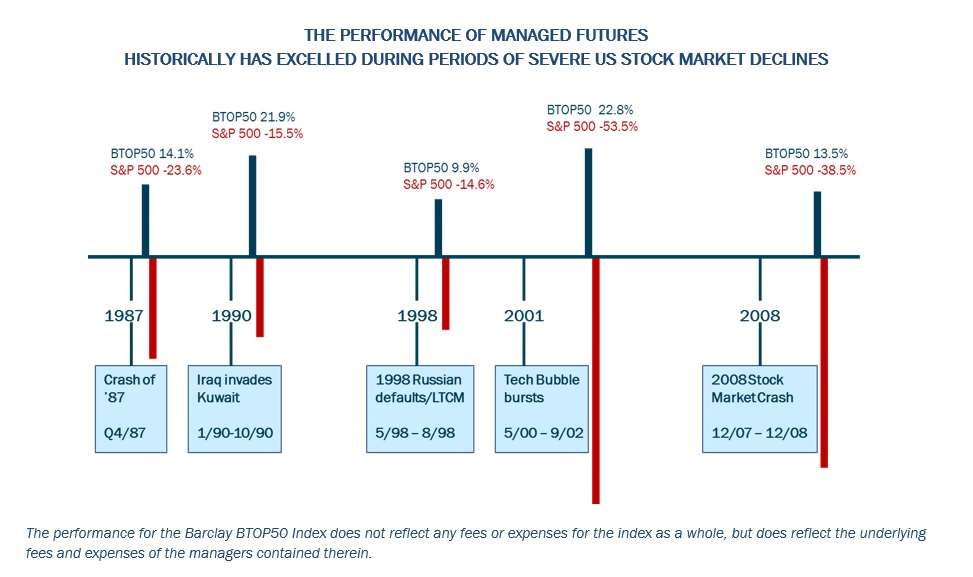
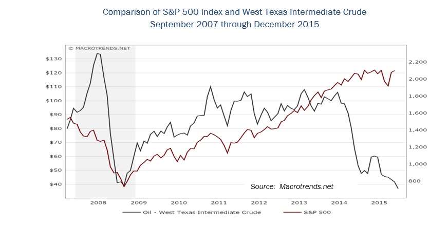
The previous graphic is a good example of aggregating multiple concepts into one clear image. Too much data when described in a series of statements to make a single point often gets diluted in impact with the volume of information contained. Sometimes, though, you want to emphasize a single point, perhaps as an opening to a topic which will be addressed in a longer fashion. Here is another important opportunity to have a strong visual graphic lend its focus to the topic at hand.
For example, the graph which follows illustrates the following statement with a lot more visual punch than this description: “Crude oil was in an extended slump since the third quarter of 2014. Demand was muted due to weak global economic growth, while production was increasing even as inventories were building.”
When marketing alternatives to investors, it’s important to communicate a clear message and develop a consistent selling strategy. The inclusion of graphics that help tell that story and sell the concepts within can go a long way to assist in the success of this effort. Wherever possible, think of ways in which you can illustrate the information that you are trying to convey and develop a library of graphics that reinforce the information which can be used across a variety of media formats.
Diane Harrison is principal and owner of Panegyric Marketing, a strategic marketing communications firm founded in 2002 specializing in alternative assets. She has over 25 years’ of expertise in hedge fund and private equity marketing, investor relations, articles, white papers, blog posts, and other thought leadership deliverables.