


By Diane Harrison
The financial world is awash in presentation decks—loaded with data, charts, tables, graphs, and an endless series of bullet points. Financial folks seem to think that lots of proof points make for strong arguments in favor of whatever they are selling. In the financial industry, many PowerPoints are assembled by analysts or other data-driven professionals, with zeal to ‘prove’ the message with lots of numbers-oriented content. But the reality is something else: lots of proof points tend to obfuscate facts and dilute the message they are supposed to be reinforcing. In the world of presentation decks, less is more.
PowerPoint, released in 1987 as part of the Microsoft Office package, revolutionized the world of content delivery with its creation of electronic presentations consisting of a series of slides, or pages. Suddenly, every Tom, Dick, and Harry with a pc could create decks of information in support of meeting presentations. Today, more than 30 million PowerPoint presentations are made every day. The trouble with so many of these presentations though, is in their content and organization, or more the lack thereof.
A TERRIBLE BUT COMPELLING EXAMPLE OF TOO MUCH IS NOT BETTER
The impetus for this article came to me when I ran across an interesting but disturbing article a couple of months ago, titled ‘Death By PowerPoint: the Slide That Killed Seven People.’ It was a short piece written by a doctor, James Thomas, on his blogsite, Mcdreamiemusings.com, back in April. The focus of it was on how a muddled, overly-complicated and poorly executed PowerPoint presentation given by the engineers in charge of the space shuttle Columbia led in some measure to the death of the crew when the shuttle blew up upon re-entry to Earth’s orbit.
A piece of foam insulation had broken off the shuttle early in the mission, causing damage to one of the wings. The unknown was whether or not the damage would impact the shuttle’s re-entry due to the extreme heat generated, and whether or not the Columbia crew should attempt a repair prior to re- entry. Thomas summarized the crucial presentation meeting on earth that ultimately dictated the fate of the seven crew members on board:
NASA officials sat down with Boeing Corporation engineers who took them through three reports; a total of 28 slides. The salient point was whilst there was data showing that the tiles on the shuttle wing could tolerate being hit by the foam this was based on test conditions using foam more than 600 times smaller than that that had struck Columbia. This is the slide the engineers chose to illustrate this point:
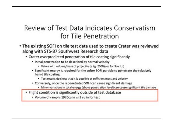
The tragic fact of this slide is buried in its terrible layout and busyness—namely, that the foam strike had caused damage to the wing in multiples of hundreds more than previous tests. Clearly, the committee should have voted to have the crew attempt a repair to the wing rather than risk re-entry in its damaged state, which was the conclusion they reached. As Thomas put it: Imagine if the engineers had put up a slide with just: “foam strike more than 600 times bigger than test data.”
TIGHTEN THE MESSAGE AND CLEAN UP THE FORMAT
While lives are not literally on the line in most of our business efforts, it can be a form of professional suicide to be a chronically poor presenter. There is a difference in presentations that are primarily used as a supplement to a verbal presentation, such as a speech, versus presentations in which the deck itself is the primary message conveyer. But in each form, brevity and clarity are paramount in importance.
Here are 10 tips for keeping your PowerPoint decks short, sweet, and on point.
- Be short, short, short – but not nonsensical.
Phrases that are memorable are, in many cases, better than complete sentences. The goal is to create content bites for the recipient. Make your point in as few words as possible, and choose these words wisely.
- Find a point of interest to use as a foil to the financials.
A lot of numerical information layered upon itself for page upon page may be technically accurate, but it can also be dull and dry. If you can help the numbers come to life with a comparison to some examples that are non-financial, it can emphasize the impact you are trying to make with data.
- Think about it as a story you are telling…one that should take five minutes.
The presentation should have a theme, an introduction, proof points, and a conclusion—much like a story. All these elements are important to creating a memorable concept for the recipient to retain. Organize your content in a logical story flow and it will immediately improve its clarity.
- Use the format to reinforce your points.
PowerPoint is a presentation software package for a reason. The layout and graphic organization of the information works with the content to deliver messages more effectively than simple words and numbers. If you are not comfortable with or creatively oriented in formatting PowerPoint, engage help from someone who is skilled in this area.
- Make it unique and custom. Avoid the boilerplate templates.
While the software comes loaded with many preformed layouts and color schemes, to create your own style, it is best to build your own look. No other deck will have the same format, and establishing your personal style in your deck ties it more closely to you and your message.
- Imagery helps!
By this I am not referring to the Clip Art version of imagery embedded in the Office suite. There is a world of free graphics and images available online that can enhance and customize the layout and feel of your deck. Spend some time looking for photos and graphics that visually improve your deck and the end result will pay off greatly in memorable ways.
- Pace your points.
While the whole presentation should be able to be absorbed within 15 minutes or less, each slide is not an equal time share. Don’t be afraid to use the tempo of content delivery as a means of enforcement for certain points you want to highlight in the deck. Some pages might have two or three brief phrases on them, where as others might have a series of overview summary data that is meant to be more of a reference page. Let the message dictate the content amount and pace of delivery.
- Embrace the white space.
Any graphic artist or artist in general knows the value of negative space, also called white space, in helping to feature that which appears around it. While not as beautiful as fine art, PowerPoint slides also use the concept of white space to set off the content of each slide. Again, if you are not visually oriented or creatively skilled in layout, use the help of someone who is. Your presentation will benefit from the attention.
- Smart and entertaining can reinforce information.
Don’t be dull above all! There’s no rule that serious information can’t be engaging as well. Being witty, using a joke that shows off a point you are trying to make within your presentation, or asking stimulating questions of your audience can all work in concert with the messages you want to deliver. Keep the interest level high and you have a better chance at making an impact with your deck.
- Solve a problem.
Using case studies and examples bring concepts to life in a way that just relaying straight information cannot do. People like to be able to relate to information, not just have data pushed at them. If possible, pose a problem and walk through a solution process that demonstrates the information you want to deliver for maximum impact on your audience.
So keep in mind that PowerPoint is a method of conveying information and not just text typed on a page sideways in large fonts. The medium is not the message, the message dictates what and how you display information in support of it.
Diane Harrison is principal and owner of Panegyric Marketing, a strategic marketing communications firm founded in 2002 specializing in alternative assets. She has over 25 years’ of expertise in hedge fund and private equity marketing, investor relations, articles, white papers, blog posts, and other thought leadership deliverables.