


By Scott Opsal
While we’re not calling for an imminent market top, we are keeping a diligent watch from the crow’s nest for signs of a coming market correction. Equity investors worried that there is a bear-shaped iceberg looming somewhere in 2018 should be evaluating defensive portfolio strategies that would enable them to escape the full impact of a potential downdraft. We believe that investing with a margin of safety is one of the best ways to protect wealth from permanent loss, and a key component of that margin is valuation. Finding safety in low valuation is a defensive strategy embraced by many fundamental investors, and our objective in this study is to review the empirical evidence as to the seaworthiness of the Value lifeboat in market storms.
We studied 13 market “tops” (defined as a high point followed by a decline of at least -10%) back to 1987. For the purposes of this study, the absolute highest close of the cycle was not always set as the peak, because in some cases the market drifted sideways before starting a full-scale decline. We pegged the date of each top as the last lofty daily close prior to a clear and meaningful drop.
Minor Tops Normal Tops Bubble Tops
Average drop -11.1% Average drop -17.9% Average drop -52.8%
Jan 2, 1990 Oct 5, 1987 Sep 1, 2000
Oct 7, 1997 Jul 16, 1990 Oct 9, 2007
Jul 20, 2015 Jul 17, 1998
Jul 16, 1999
Jan 14, 2003
Apr 23, 2010
Jul 22, 2011
Nov 3, 2015
For each market cycle we quintiled the top 1,000 U.S. companies using four different valuation metrics:
- Earnings Yield on trailing 12-month EPS;
- A customized version of Earnings Yield with quintile five holding only money-losing companies;
- Earnings Yield on forward 12-month EPS; and,
- Free Cash Flow Yield
To examine the protective qualities of Value during a market downturn, we calculated the daily equally-weighted returns for each valuation quintile beginning 60 trading days prior to the peak and ending 100 trading days after the peak for normal cycles, 60 days after the peak for short cycles, and 200 days after the peak following the bubble tops. If our lifeboat hypothesis is correct, we would expect to see the cheapest quintiles underperform going into a market peak, then outperform as the correction takes its toll on the most expensive stocks.
Base Case Outcomes
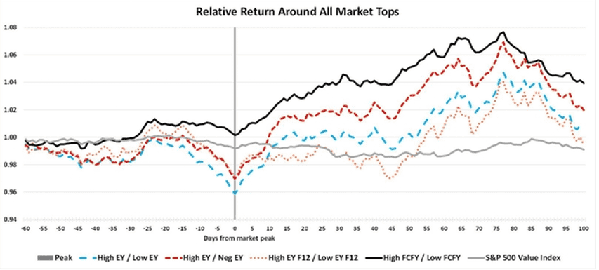
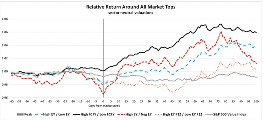
Chart 1 illustrates the average relative return of the least expensive versus most expensive quintiles around all market peaks, with a rising line meaning that cheap stocks are outperforming expensive stocks. This chart shows slight Value underperformance heading into a peak, then modest outperformance after a top. Note that Value’s run lasts about 75 days on average, and the relative outperformance is 7% to 9% from the low. Free Cash Flow Yield appears to be the strongest definition of Value going into a market top and holds the advantage throughout the cycle. As a check on our calculations, we also plotted the S&P 500 Value Index relative to the S&P 500, shown as the gray (light) solid line in Chart 1. While our company level groupings provided reasonable excess returns following market tops, we were astounded that the S&P Value Index itself provided no benefit over the core S&P 500 as the peaks rolled over into a declining phase.
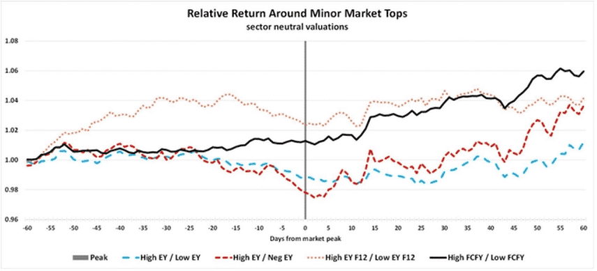
Suspecting that Value performs differently based on the severity of the correction, we break out minor peaks, normal peaks, and bubble peaks as separate exhibits. Chart 2 depicts relative performance around the three minor peaks in our study; those in which the following correction lasted less than 40 days and averaged a loss of just -11.1%. In this case, Value stocks experienced almost no return give-up prior to the peak but did offer a return advantage as the market sank. Interestingly, our forward-looking measure of Value performed best, perhaps because investors come to realize that a major reset in expectations is not imminent and earnings estimates may still prove reliable.
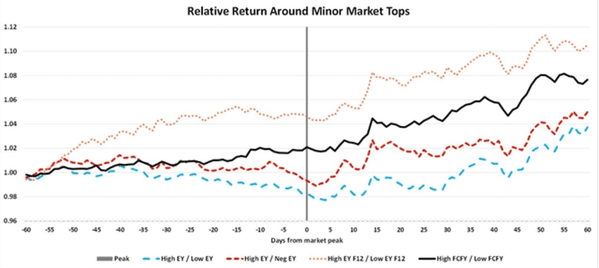
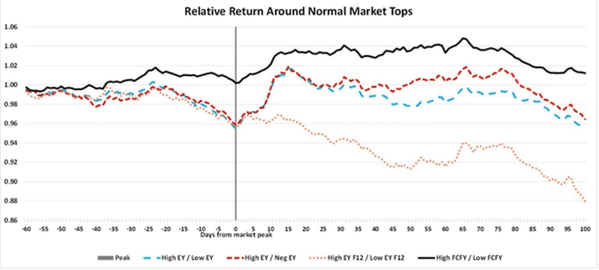
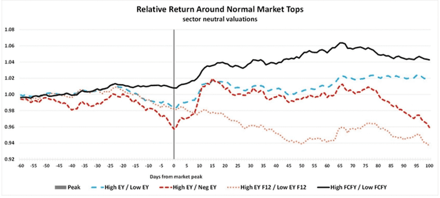
Chart 3a covers the eight normal market peaks which average a -17.9% correction. This chart’s results are quite surprising, showing that Value may give up a little return into the peak, but never demonstrated breakout performance after the peak. In fact, 100 days after a top, Value underperformed on three measures and FCFY is almost a wash; a result we found astonishing.
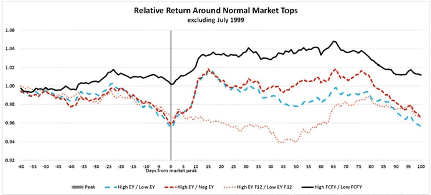
The gold (small dotted) line representing forward EY is an outlier, as stocks with minimal or negative forward earnings appear to significantly outperform. Looking closer, we find that the July 1999 peak (preceding the major tech bubble top in 2000) saw ridiculously-priced tech stocks outperform Value stocks by an incredible 70% following that peak and leading into the ultimate top in 2000. Excluding this single event returns the forward EY line to levels near the other three, as seen in Chart 3b.
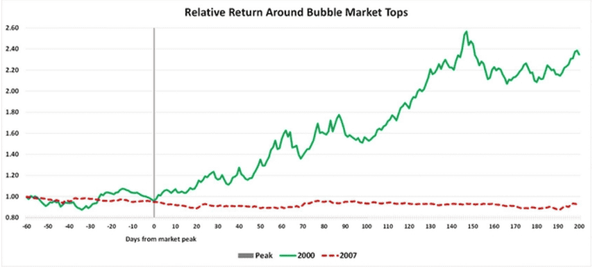
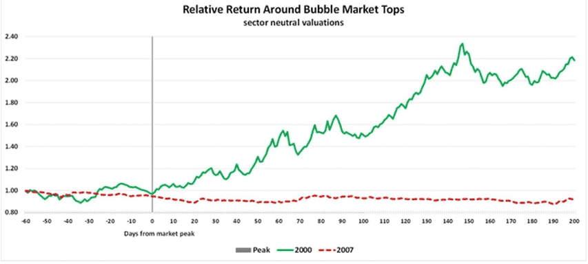
Our investigation of the two major bubble tops revealed completely different return patterns, leading us to reformat our charts to highlight that disparity. We combined the four individual Value metrics into one composite Value reading, and plotted years 2000 and 2007 separately. Chart 4 illustrates the radically different nature of Value around the bubble peaks. In the 2000 top, driven by the extraordinary valuation of tech, media, and telecom stocks, Value generated outstanding relative returns as overpriced “vision” stocks (companies with negative current earnings or extremely high valuations trading primarily on hopes of a brighter tomorrow) crashed and burned.
Market troubles in 2007 ensnared many traditional Value groups including banks, insurance companies, and housing. Because of this, Value provided no benefit whatsoever, as cheap financials became even cheaper, and Value remained a laggard nearly a year after the top.
Sector Neutral Results
Given the importance of key sectors at market tops, we repeated our analysis by calculating valuations on a sector neutral basis to see if the sector influences already mentioned were obscuring the Value signals. Chart 5 shows sector neutral Value returns for all market peaks, and the story changes little. Value lagged slightly into the top and then gained 6% to 10% as the market declined. On a sector neutral basis, FCFY is again the top performing Value metric.
The sector neutral performance story around minor tops (Chart 6) is similar, with Value holding steady into the top and showing single digit relative gains in the sell-off. In fact, FCFY and EY F12 outperformed going into the peak, meaning that investors looking to get defensive by tilting toward Value stocks can buy that protection without giving up returns if the top develops into just a mild pullback.
Value’s return advantage following normal market tops remains positive but rather disappointing on a sector neutral basis; Chart 7 also demonstrates a modest advantage for FCFY. Here again, we see “vision” stocks doing particularly poorly.
Major tops (Chart 8) offer a pattern similar to Chart 4, which surprised us given the importance of specific sectors in each major top. We expected that defining Value on a sector neutral basis would mute the impacts of tech in 2000 and financials in 2007, but the outcome remains remarkably divergent.
Overall, the sector neutral results in Charts 5-8 retained patterns similar to the results in Charts 1-4. One notable difference was in the relative returns associated with normal market tops, where results in Chart 7 are more positive toward Value once the tech bubble oddity of mid-1999 is minimized via sector neutral valuations.
Investment Takeaways
- We were impressed by the modest return give-up posted by Value stocks in the months prior to market peaks. Apparently, the Value insurance policy can be purchased for a fairly small premium.
- We were underwhelmed by Value’s return advantage following market tops, expecting a more profound payoff from taking refuge in Value. While a 6% to 10% return pickup is nothing to sneeze at, particularly in the midst of a 20% market decline, we had hoped for a bit more.
- The benefits of a Value tilt fade or even reverse about 75 days after a market top. This is consistent with the average 78-trading day length of normal sell-offs in our study. Unless it appears that we are in the process of popping a euphoric bubble, investors should guard against overstaying their time in the Value lifeboat.
- The two bubble tops suggest that each market mania brings its own disequilibrium and mispricing that needs to be resolved, leaving a generalized conclusion unresolved.
- Free Cash Flow Yield commonly performed the best, while “vision” stocks that are priced more on hope than reality, performed particularly poorly.
- A minor caveat is that we only have company level valuation data covering 13 market tops, and five of those spanned the tech bubble era from 1997 to 2002. This limited sample size leaves plenty of room for slippage, but our broad understanding of the Value factor over time convinces us that these results are somewhat helpful in positioning for an eventual market top.